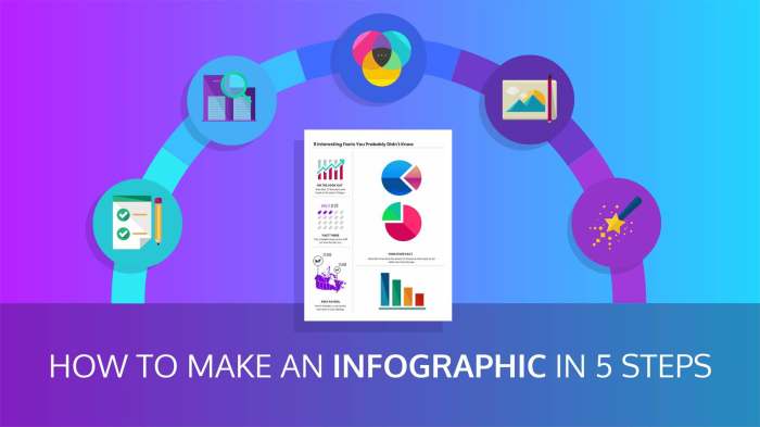
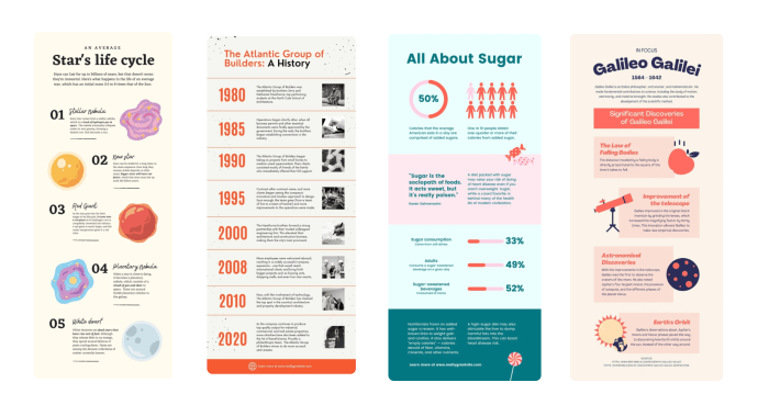
Creating Infographics kicks off the visual storytelling journey, showcasing the power of design in conveying impactful messages. Dive into the world of infographics where colors, fonts, and images unite to create compelling narratives.
Introduction to Creating Infographics
Infographics are visual representations of information or data designed to make complex ideas more easily understandable. They combine images, charts, and text to convey a message quickly and clearly. The purpose of infographics is to simplify information and present it in a visually appealing way.
Infographics are effective in conveying information because they engage both the visual and textual parts of the brain, making it easier for people to remember and understand the content. They also help break down complex concepts into digestible chunks, making information more accessible to a wider audience.
Common Uses of Infographics
- Marketing and Advertising: Companies use infographics to showcase data, statistics, or product information in a visually appealing way to attract customers.
- Education: Teachers use infographics to explain complex topics to students in a more engaging manner.
- Social Media: Infographics are popular on platforms like Instagram and Pinterest for sharing information in a visually appealing format.
- Healthcare: Medical professionals use infographics to explain health conditions, treatment options, or preventive measures to patients.
Importance of Visual Elements in Infographics: Creating Infographics
Visual elements play a crucial role in creating engaging and effective infographics. Colors, fonts, and images are key components that can enhance the overall message and make the information more visually appealing to the audience.
When it comes to colors, selecting the right color palette can help convey emotions, highlight important points, and create a cohesive look. It’s important to choose colors that complement each other and align with the overall theme of the infographic.
Fonts also play a significant role in design. The choice of font can impact readability and the overall aesthetic of the infographic. It’s essential to use fonts that are easy to read and align with the tone of the content. Mixing different font styles can add visual interest and hierarchy to the information presented.
Incorporating relevant images can further enhance the visual appeal of infographics. Images can help illustrate complex ideas, break up text-heavy sections, and create a more engaging experience for the audience. It’s important to use high-quality, relevant images that support the message and add value to the overall design.
Choosing the Right Visual Elements
When selecting visual elements for infographics, consider the following tips:
- Align visual elements with the main message and purpose of the infographic.
- Use colors strategically to guide the viewer’s attention and create a visual hierarchy.
- Ensure fonts are easy to read and complement the overall design aesthetic.
- Select images that enhance the content and provide context or clarification.
Steps to Create Compelling Infographics

Creating a compelling infographic involves a step-by-step process that combines creativity, design skills, and storytelling techniques to engage the audience effectively.
Ideation and Planning
To start, brainstorm ideas and determine the main message you want to convey through the infographic. Consider the target audience and the key information you want to highlight. Artikel the structure and flow of the content to ensure a cohesive narrative.
Visual Design and Layout
Once you have a clear plan, focus on the visual elements of the infographic. Choose a color scheme that aligns with your brand or message and select fonts that are easy to read. Create engaging visuals such as charts, graphs, icons, and illustrations to support the information.
Storytelling and Flow, Creating Infographics
Infographics should tell a story or convey a message in a visually engaging way. Ensure a logical flow of information from start to finish, guiding the viewer through the content seamlessly. Use headers, subheadings, and visual cues to enhance the narrative and keep the audience interested.
Tools and Software
There are various tools and software available to help create professional-looking infographics. Popular options include Canva, Piktochart, Adobe Illustrator, and Venngage. These platforms offer templates, design elements, and customization options to bring your infographic to life.
Data Visualization Techniques

Data visualization techniques play a crucial role in creating engaging and informative infographics. By effectively representing data through charts, graphs, and diagrams, you can simplify complex information for better understanding. Here are some common data visualization techniques and tips on how to use them in your infographics:
Charts
Charts are a powerful way to visually represent data and trends. Bar charts, pie charts, line charts, and scatter plots are some popular types of charts used in infographics. When using charts, make sure to choose the right type that best represents your data. Keep the design simple and easy to read, with clear labels and legends to help the audience understand the information being presented.
Graphs
Graphs are another effective data visualization technique that can help illustrate relationships and comparisons in data. Common types of graphs include bar graphs, line graphs, and area graphs. Use graphs to show trends over time, compare different data sets, or highlight key insights. Remember to use contrasting colors and scales to make the information visually appealing and easy to interpret.
Diagrams
Diagrams are visual representations of information or processes, such as flowcharts, mind maps, or Venn diagrams. They can be used to explain complex concepts or relationships in a simple and straightforward manner. When creating diagrams for your infographic, focus on clarity and hierarchy to guide the audience through the information. Use icons, arrows, and labels to enhance the visual appeal and make the data more engaging.
Tips for Effective Data Visualization
– Choose the right type of visualization that best suits your data and message.
– Keep the design simple, with a clear layout and hierarchy of information.
– Use color strategically to highlight key points and create visual interest.
– Provide context and labels to help the audience understand the data being presented.
– Test your infographic with a sample audience to ensure it effectively communicates the intended message.